


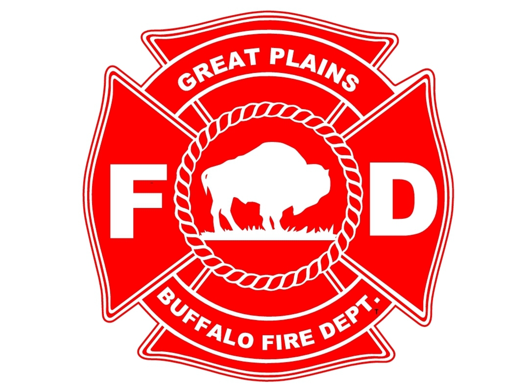
Great Plains Buffalo Fire Department – New Emblem/Logo
Designing a Symbol of Protection for the Great Plains Buffalo Fire Department
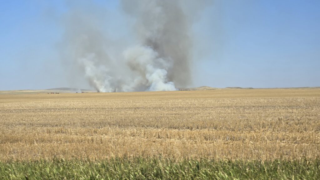
In the heart of Reva, South Dakota, the Great Plains Buffalo Fire Department stands as a steadfast guardian against the relentless prairie fires that sweep through the region. These brave firefighters risk their lives to protect the land and its inhabitants, and their fire trucks are essential tools in this battle. As a tribute to their bravery and dedication, I set out to design a new fire logo emblem that would adorn these trucks, symbolizing their strength and unity.
The Vision
The project began with a simple yet profound vision: to create a logo that encapsulates the essence of the Great Plains and the resilience of the Great Plains Buffalo Fire Department. I wanted a design that would inspire confidence, respect, and a sense of pride among the firefighters and the community they serve.
Inspiration from the Plains
Drawing inspiration from the vast, windswept prairies of South Dakota, I envisioned a logo that would blend the natural beauty of the land with the spirit of the buffalo—a symbol of strength and endurance. The buffalo, an iconic figure in the region, represents the rugged determination of the firefighters who stand against the flames.
Elements of the Design
The Buffalo
At the heart of the emblem is a powerful image of a buffalo, with unyielding determination. Its muscular form and fierce expression capture the strength and bravery of the fire department. The buffalo is surrounded by a ring of rope, symbolizing the fires they combat, capture, surround and extinguish.
The Colors
The color palette chosen for the emblem includes fiery red representing the intensity of the flames and white representing strength and hope. These colors create a striking contrast that makes the logo stand out on the white fire trucks.
Bringing the Logo to Life
With the design concept finalized, we moved on to the creation process. As a skilled graphic designer, I was able to bring the vision quickly to life, ensuring every detail reflected the values and spirit of the Great Plains Buffalo Fire Department. The final logo was meticulously crafted, with each element carefully balanced to create a cohesive and impactful design.
Unveiling the Emblem
The unveiling of the new fire logo emblem was a moment of pride and celebration for the Great Plains Buffalo Fire Department. The emblem now adorns their fire trucks, serving as a constant reminder of their mission and the indomitable spirit of the firefighters. It stands as a symbol of their unity, strength, and unwavering commitment to protecting their community.
Conclusion
Designing the new fire logo emblem for the Great Plains Buffalo Fire Department was an honor and a deeply rewarding experience. The emblem not only enhances the visual identity of the fire trucks but also tells a story of resilience, bravery, and the enduring spirit of the firefighters. As the fire trucks roll out to face the prairie fires, the emblem serves as a beacon of hope and a testament to the dedication of those who protect the Great Plains.
Join the Conversation
What do you think of the new fire logo emblem? Share this story and let me know how this design resonates with you. Together, let’s celebrate the heroes of the Great Plains Buffalo Fire Department and their unwavering commitment to keeping our community safe.